A brand building art director passionate about ➺ exploring type, design and a bit of motion ✴︎ Currently based
in Dubai︎
A brand building art director passionate about ➺ exploring type, design and a bit of motion ✴︎ Currently based
in Dubai︎
Client
Agthia UAE
Agthia UAE
Brand Identity
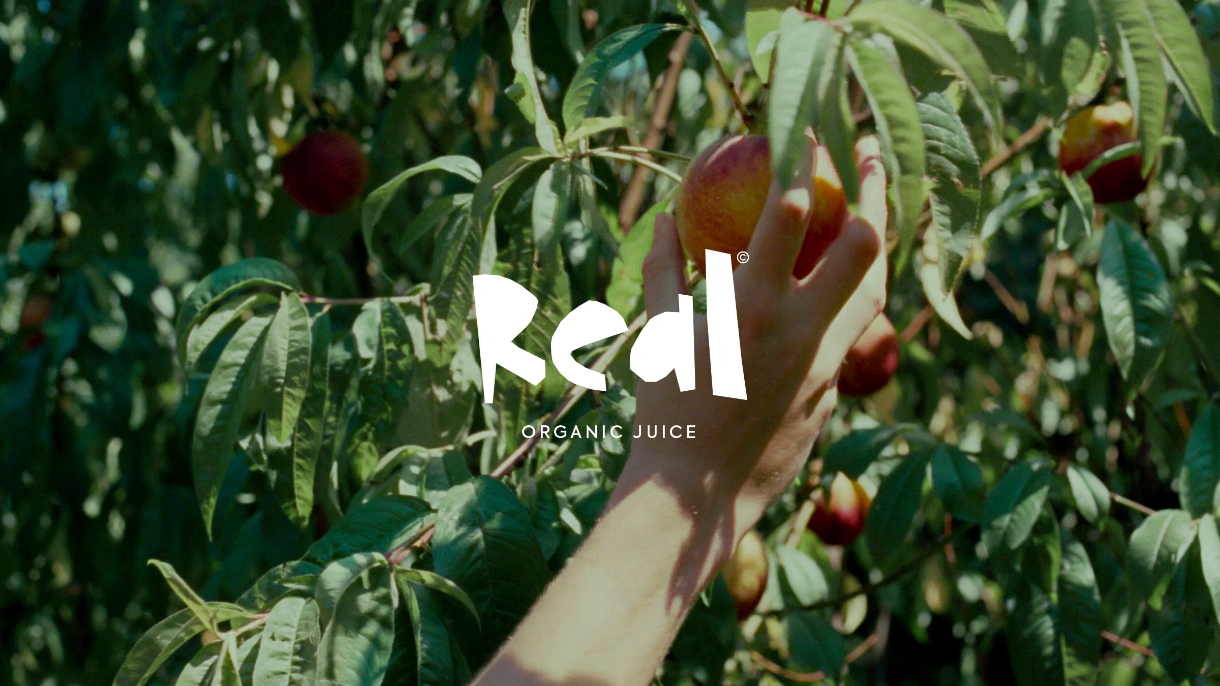
Real Juice by Agthia
Real Juice by Agthia
Agency
Leo Burnett
Creative Director
Anton Marais
Camilo Molina
Copywriter
Alison Cordeiro
Leo Burnett
Creative Director
Anton Marais
Camilo Molina
Copywriter
Alison Cordeiro
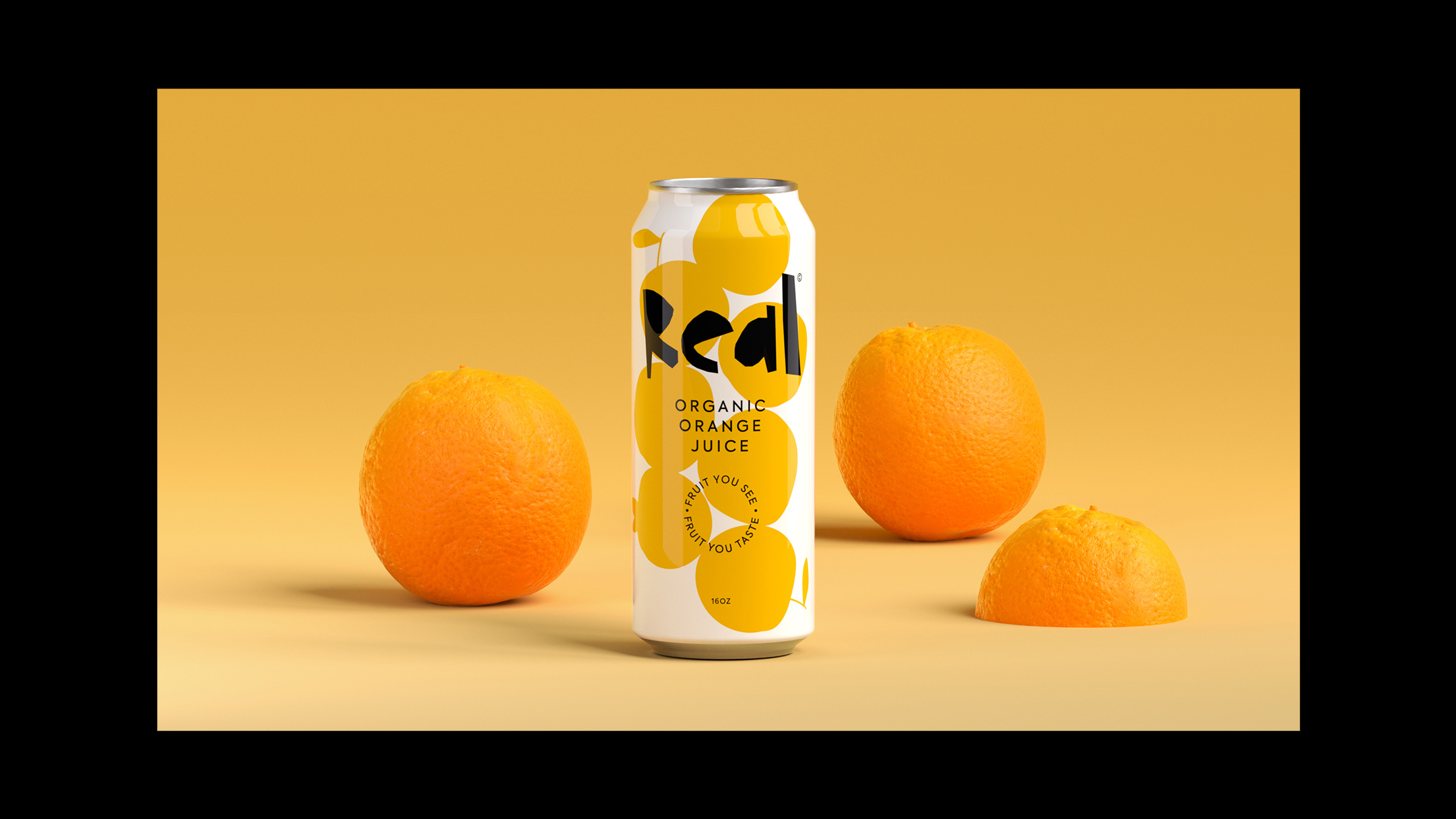
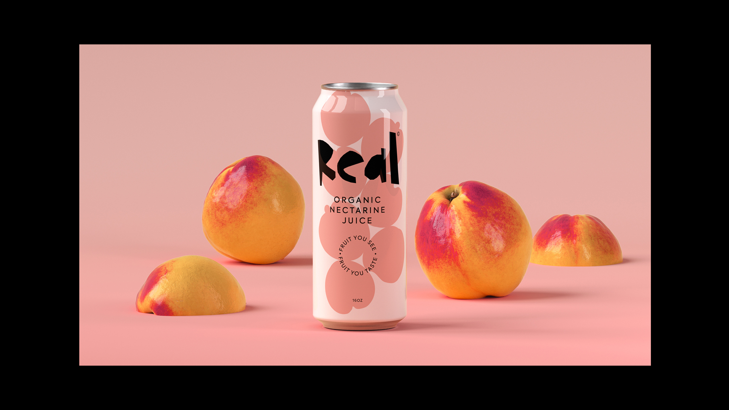
Real Juice is the first canned fruit juice made in the UAE—a refreshing take on an everyday staple, designed for a new generation of consumers who value authenticity, simplicity, and quality.
Real is about the idea of being effortlessly natural and unapologetically laid-back. From the name to the visuals, everything about Real says, “what you see is what you get”—real fruit, simple flavour.
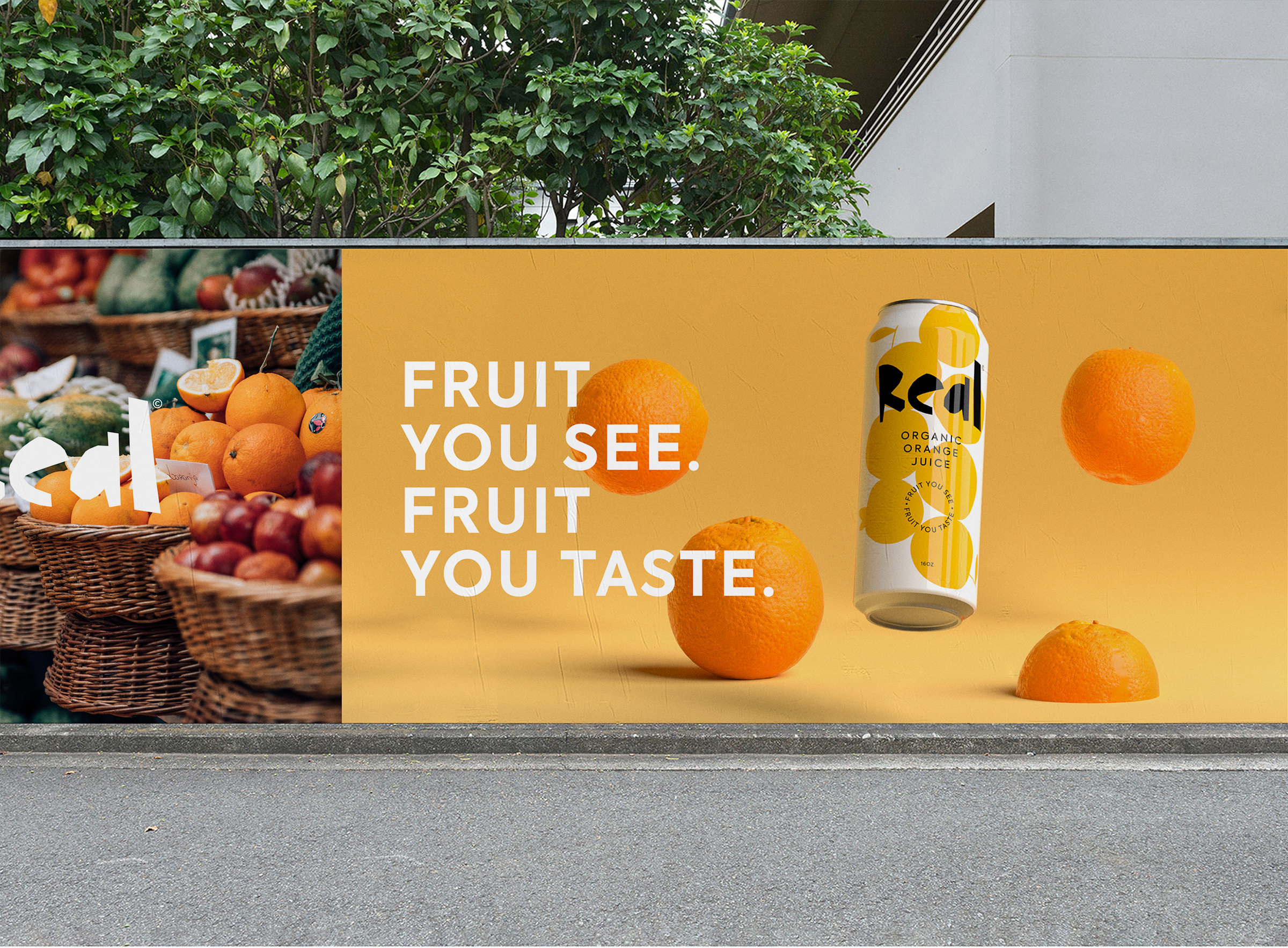
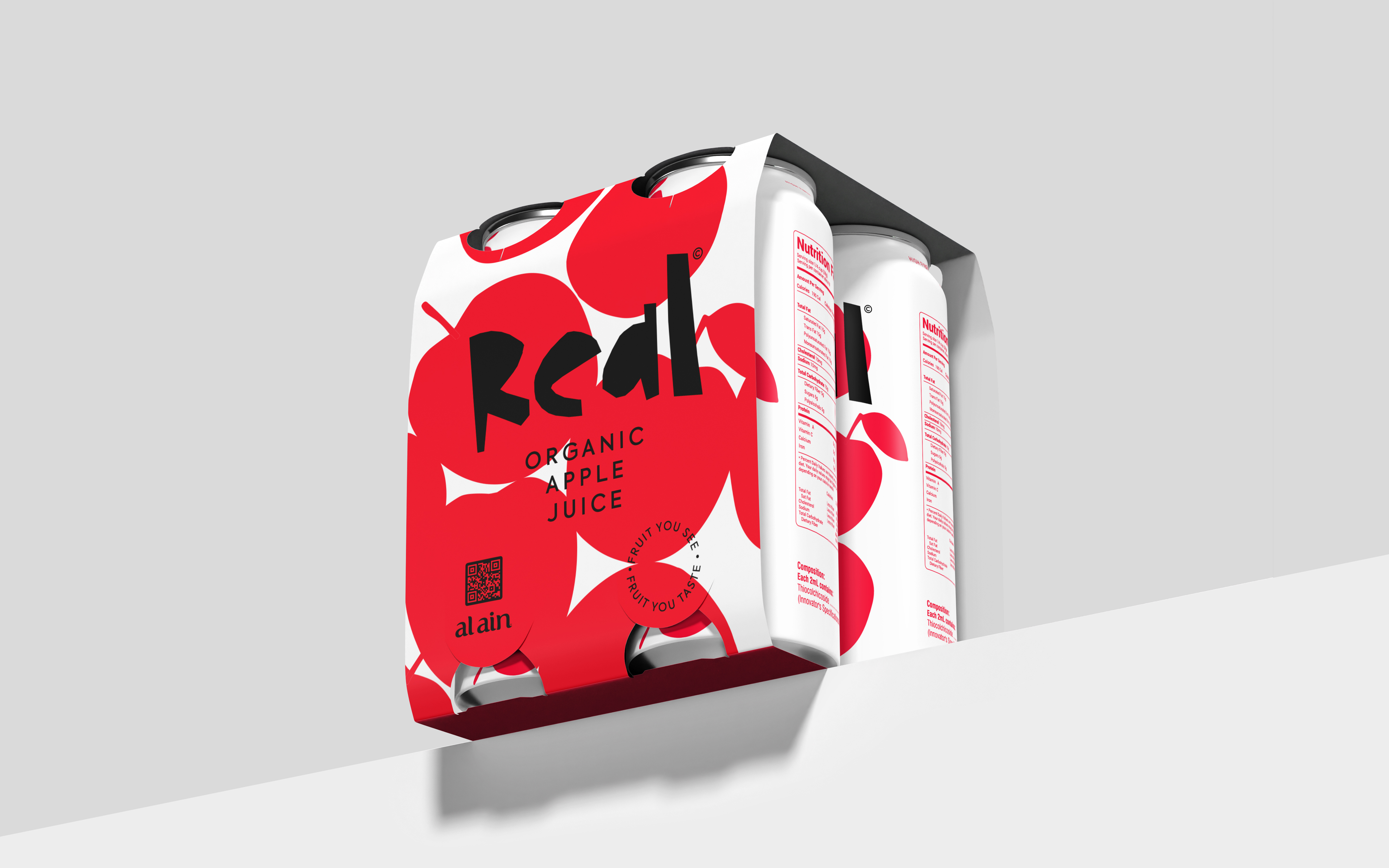
The can design captures this idea through minimal, playful shapes. Bold colored fruit graphics tumble freely across the surface, mimicking the organic, unscripted way fruit might fall into a juicer. This motion gives the label its rhythm—fresh, spontaneous, and vibrant. The logotype, with its clean yet slightly irregular forms, complements this energy, reinforcing the idea of something real and unfiltered.
The identity works just as well on a small cap as it does on a billboard. Whether it’s a street-side ad, a fridge pack, or a social media post, its modular design language is made to grow with the brand.
Real is about the idea of being effortlessly natural and unapologetically laid-back. From the name to the visuals, everything about Real says, “what you see is what you get”—real fruit, simple flavour.
The can design captures this idea through minimal, playful shapes. Bold colored fruit graphics tumble freely across the surface, mimicking the organic, unscripted way fruit might fall into a juicer. This motion gives the label its rhythm—fresh, spontaneous, and vibrant. The logotype, with its clean yet slightly irregular forms, complements this energy, reinforcing the idea of something real and unfiltered.
The identity works just as well on a small cap as it does on a billboard. Whether it’s a street-side ad, a fridge pack, or a social media post, its modular design language is made to grow with the brand.