A brand building art director passionate about ➺ exploring type, design and a bit of motion ✴︎ Currently based
in Dubai︎
A brand building art director passionate about ➺ exploring type, design and a bit of motion ✴︎ Currently based
in Dubai︎
Client
KPS Sweden/UAE
KPS Sweden/UAE
Brand
KPS Brand Identity
Agency
Leo Burnett UAE
Creative Director
Camilo Molina
Anton Marais
Copywriter
Allison Cordeiro
Motion Designer
Karen Bueno
Account Manager
Klaudia Gerslak
Leo Burnett UAE
Creative Director
Camilo Molina
Anton Marais
Copywriter
Allison Cordeiro
Motion Designer
Karen Bueno
Account Manager
Klaudia Gerslak
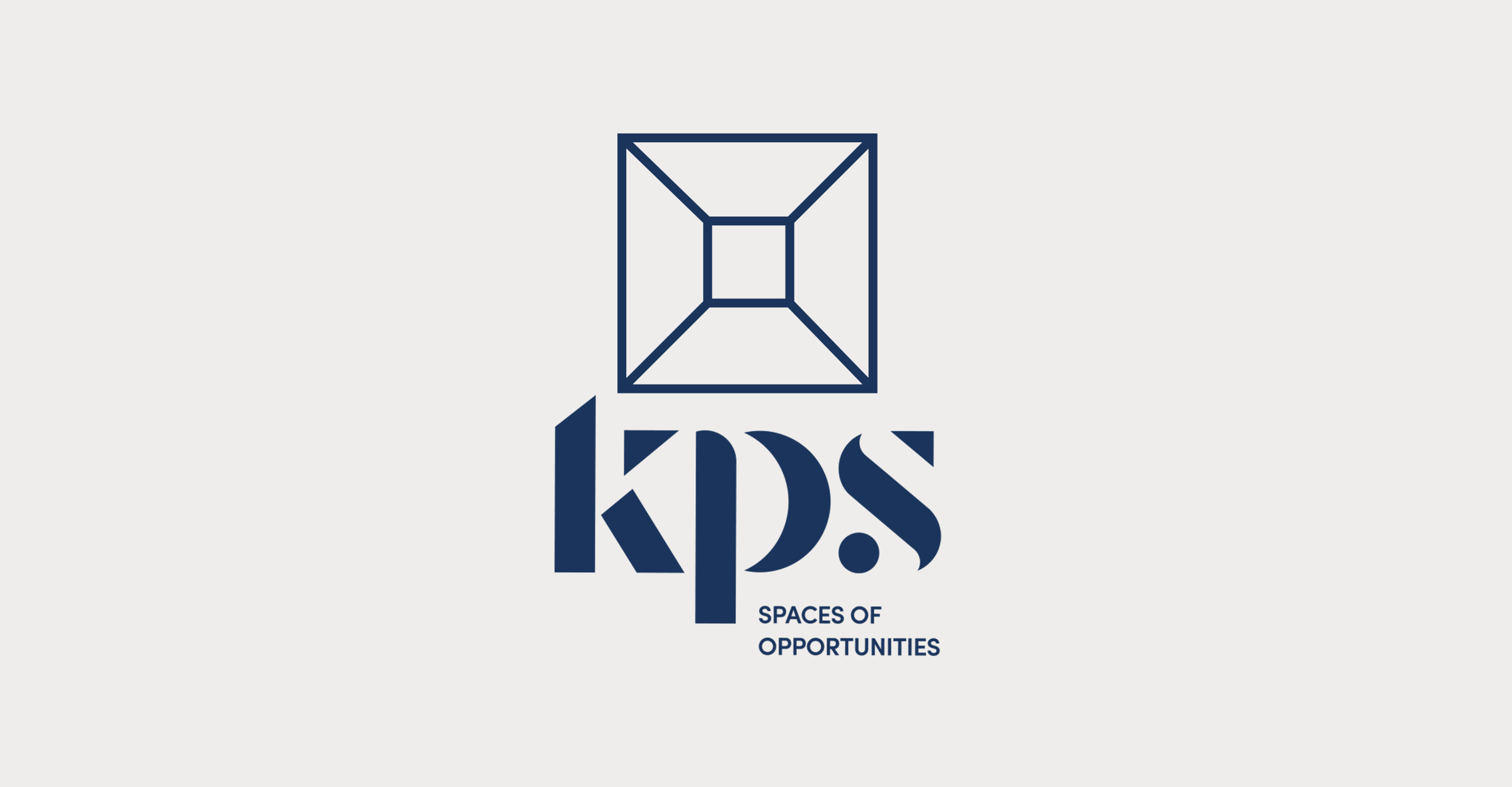
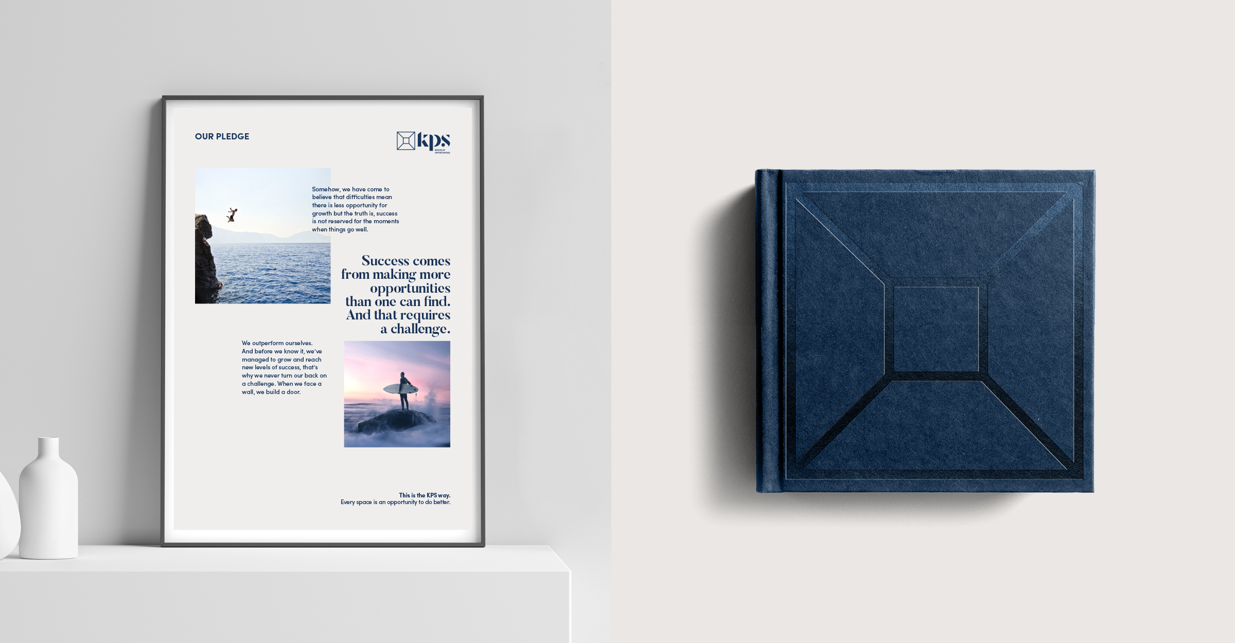
KPS is a Swedish technology-led, design-focused interior company that brings commercial spaces to life by tapping into trends, innovations, and resources. They believe every space holds the opportunity for something remarkable.
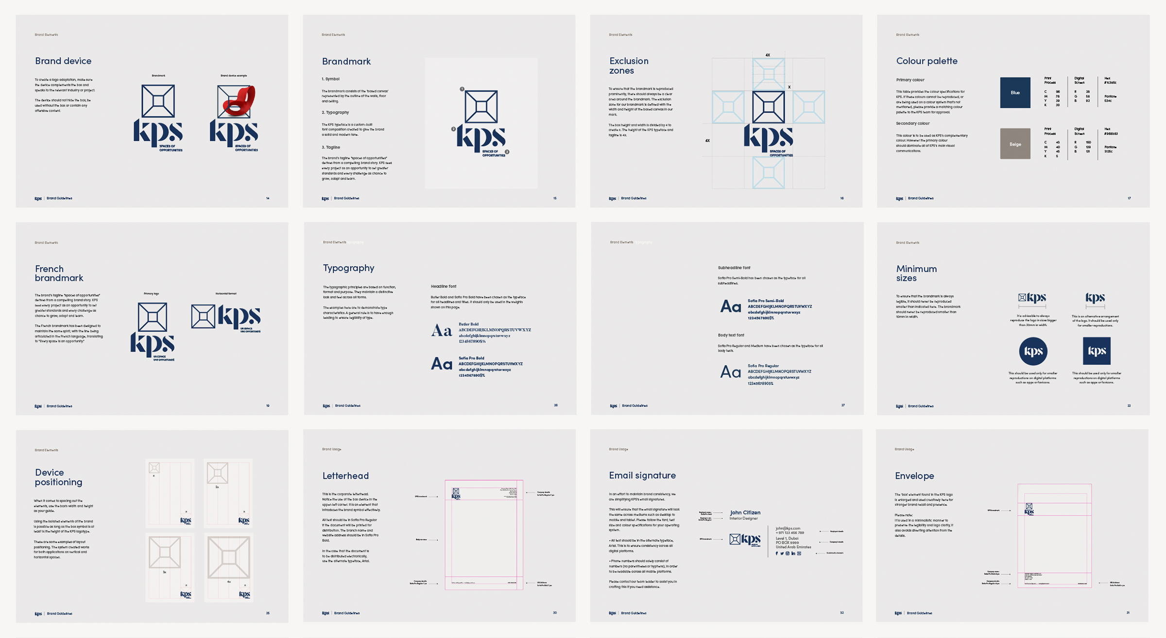
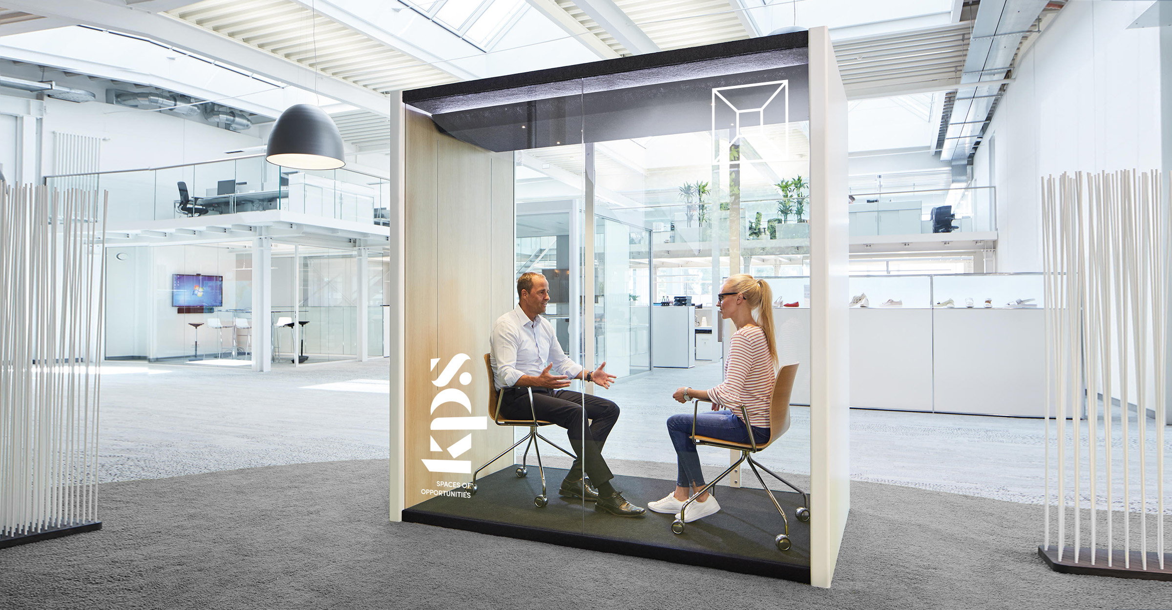
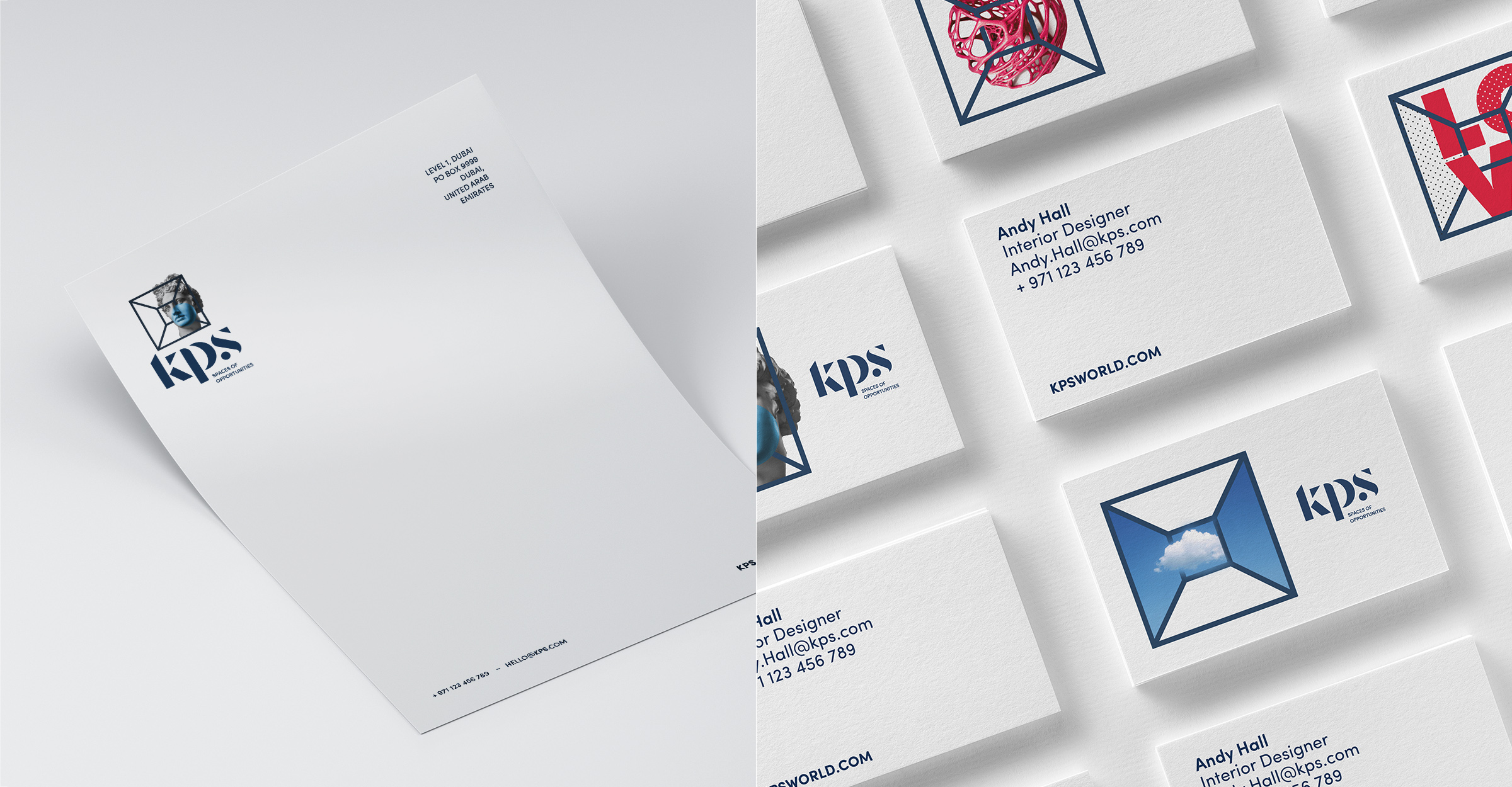
Given the commercial requirement, the KPS logo was created with the flexibility to be anything, enabling the company to flip the hierarchy of the identity depending on the audience and markets.
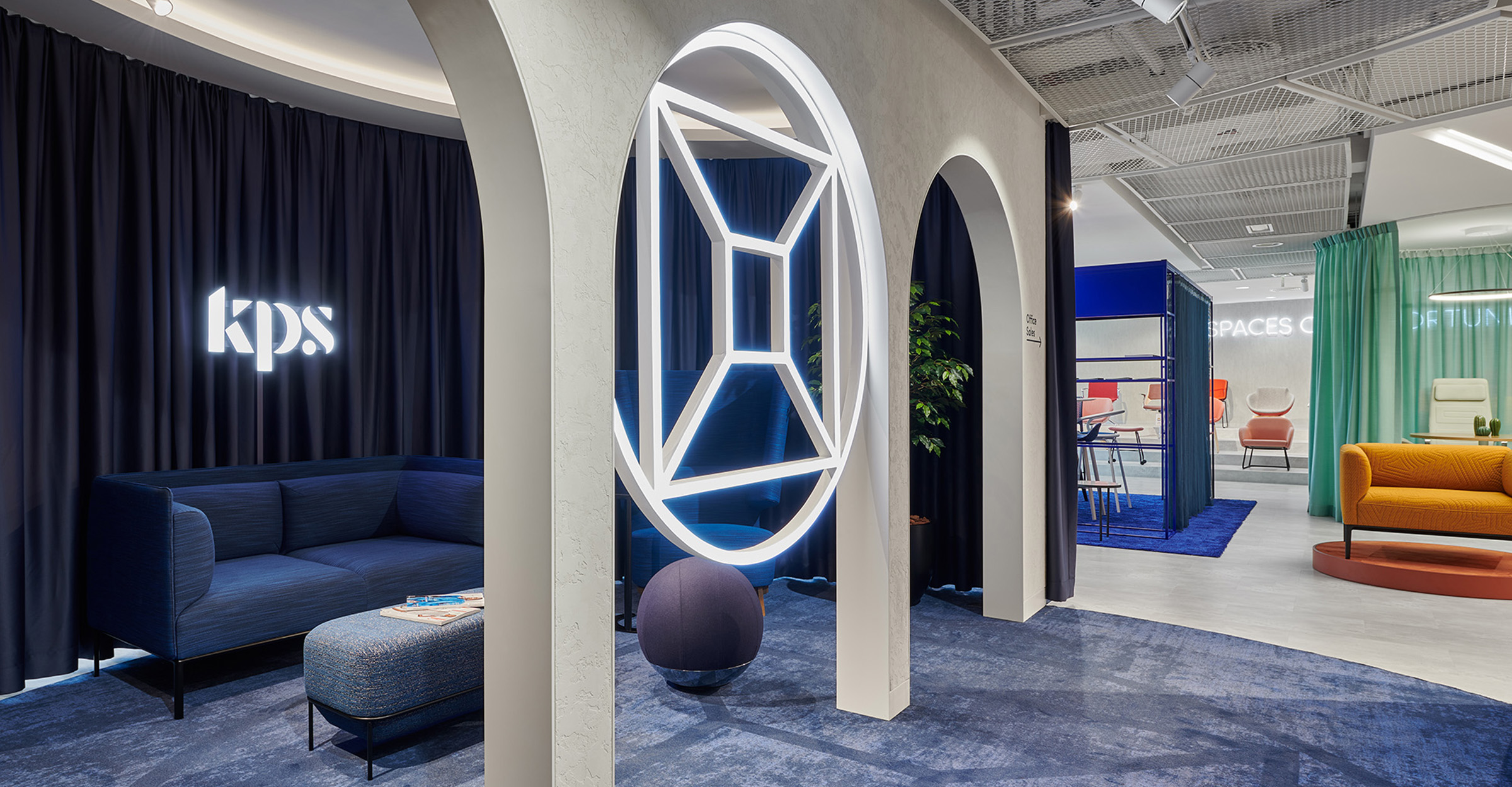
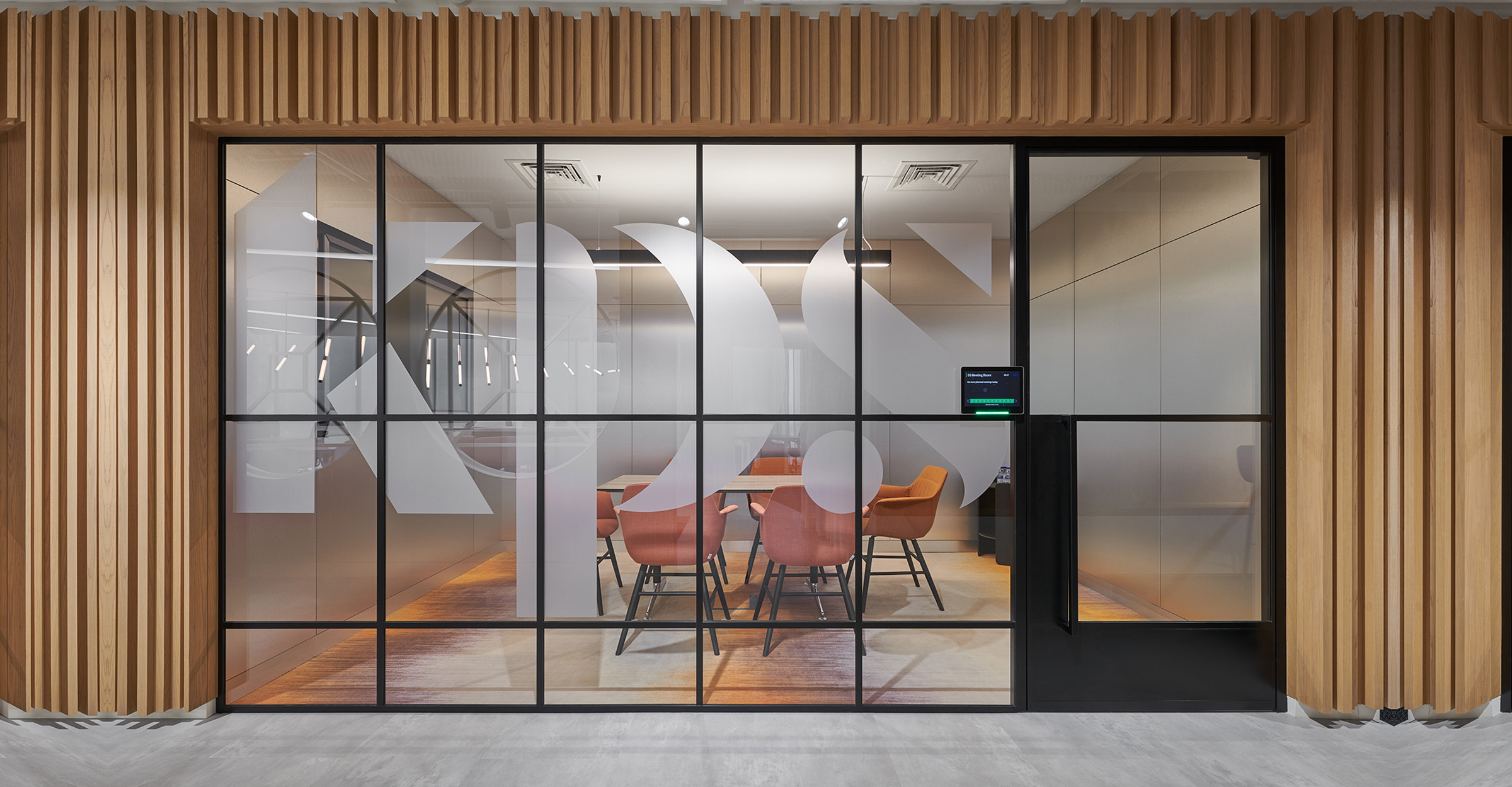
We began by amplifying the precinct’s energy through every expression of the brand identity. A versatile brand identity was built upon the theme of “spaces of opportunities” inspired by the diversity of the different businesses and sectors KPS wants to reach.
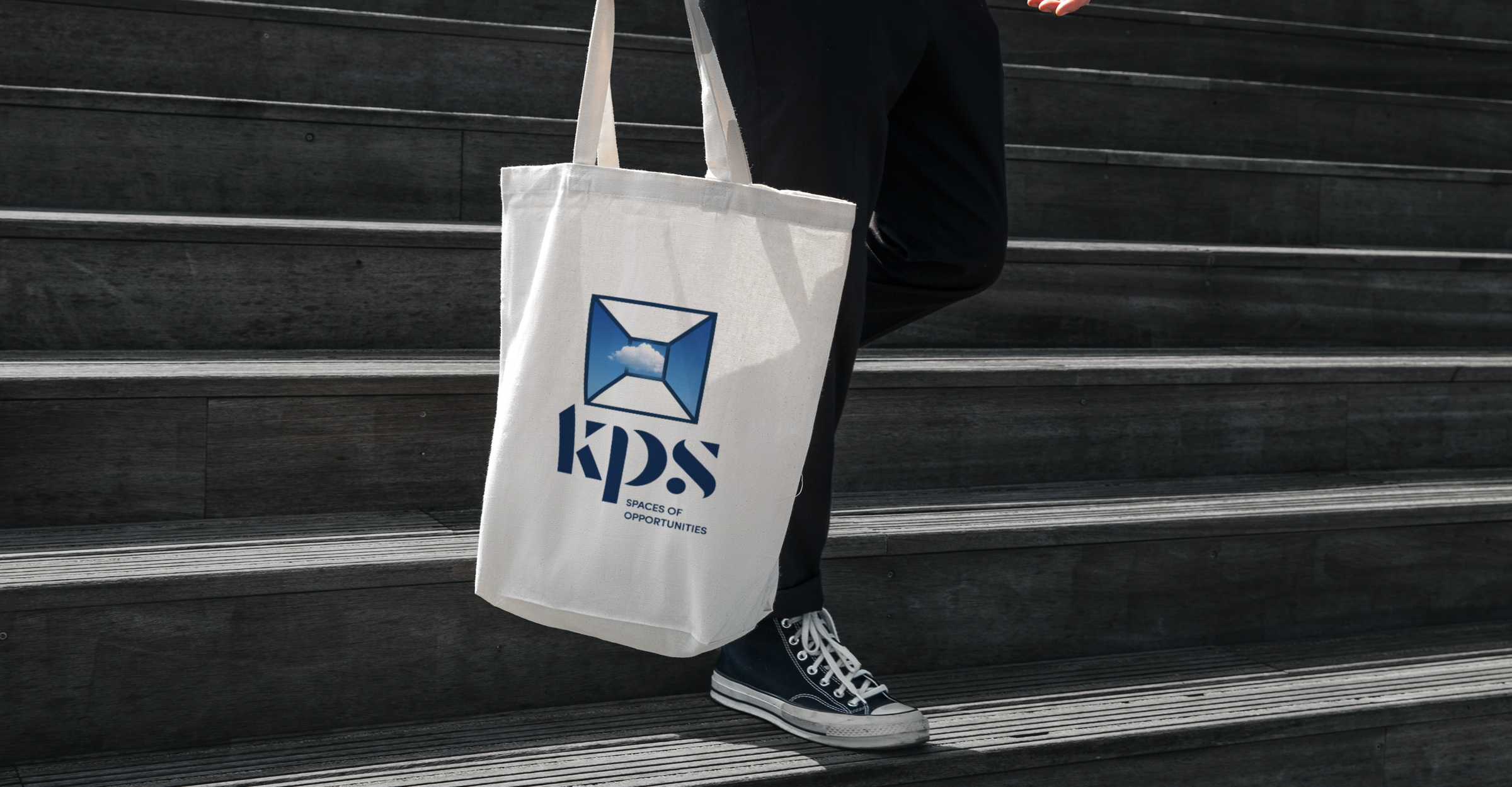
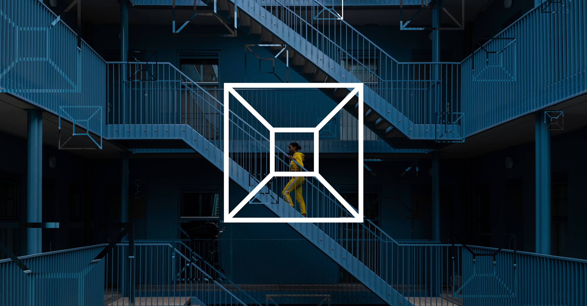
The box is a creative interpretation of a blank room, where we can imagine a space for endless possibilities. It’s represented by the outline of all the walls, floor, and ceiling. KPS is a brand that leans into new fields and areas of expertise – which is represented by the logo adaptations. The brand’s agility is directly translated into design by using the space symbol as a device.
To check more go to kpsworld.com
Given the commercial requirement, the KPS logo was created with the flexibility to be anything, enabling the company to flip the hierarchy of the identity depending on the audience and markets.
We began by amplifying the precinct’s energy through every expression of the brand identity. A versatile brand identity was built upon the theme of “spaces of opportunities” inspired by the diversity of the different businesses and sectors KPS wants to reach.
The box is a creative interpretation of a blank room, where we can imagine a space for endless possibilities. It’s represented by the outline of all the walls, floor, and ceiling. KPS is a brand that leans into new fields and areas of expertise – which is represented by the logo adaptations. The brand’s agility is directly translated into design by using the space symbol as a device.
To check more go to kpsworld.com